Introduction
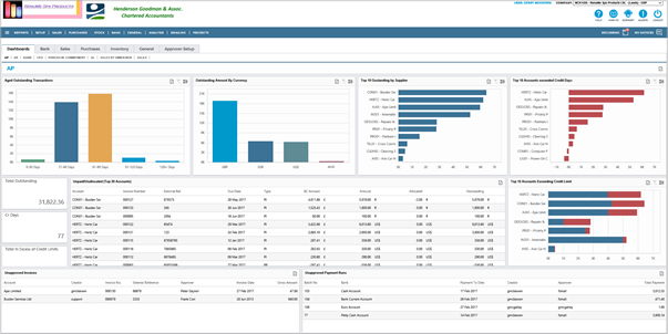
The Accounts Payable (AP) Dashboard is a set of pre-defined Charts and Lists. If your industry or organisation type has specific requirements and you want to add your own charts and lists, then contact your system provider for assistance.
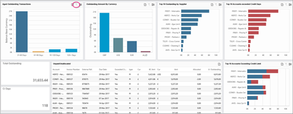
The AP Dashboards display your outstanding debts to your Company’s Suppliers (Vendors). It analyses the outstanding amounts by category, along with pending Creditor Payment Runs and, if relevant, a list of Purchase Invoices awaiting approval.
Viewing the Dashboards
Go to Dashboards. Each of AIQ's modules has a comprehensive set of Dashboards. Most of these Dashboards are interactive, containing drill-down facilities for further in-depth examination of the data.
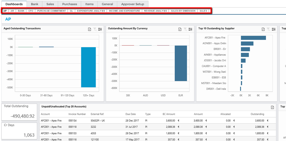
Due to the high data density, it can take a moment for Dashboards to load.
See:
 Reporting and Data Queries Overview (11.0) - AIQ Academy
Behaviour
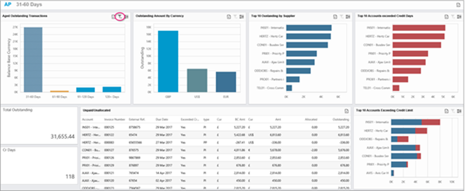
Many of the Dashboards are interconnected. Clicking on a bar in a Bar Chart will filter and modify the other Bar Charts accordingly. For example, if you click the 31-60 days bar in the Aged Outstanding Transactions chart, then all other bar charts will show outstanding transactions with the same date range.
In addition, the Unpaid/Unallocated Transaction List will only show transactions making up a particular Bar in a particular Chart. If you do not click a bar, then this list shows the Top Twenty Accounts in Account sequence order.
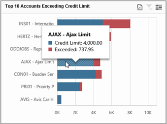
Hovering over a Bar will display its values.
Tools: Export, Filter, and Multi-Select
There are several common symbols for tools in the Dashboard.
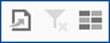
Export
Click the first symbol to open a dropdown with the options; Export to PDF, Export to Image, and Export to Excel or CSV.
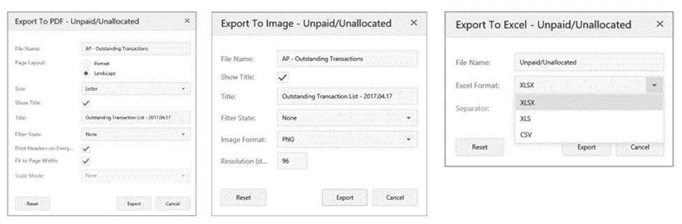
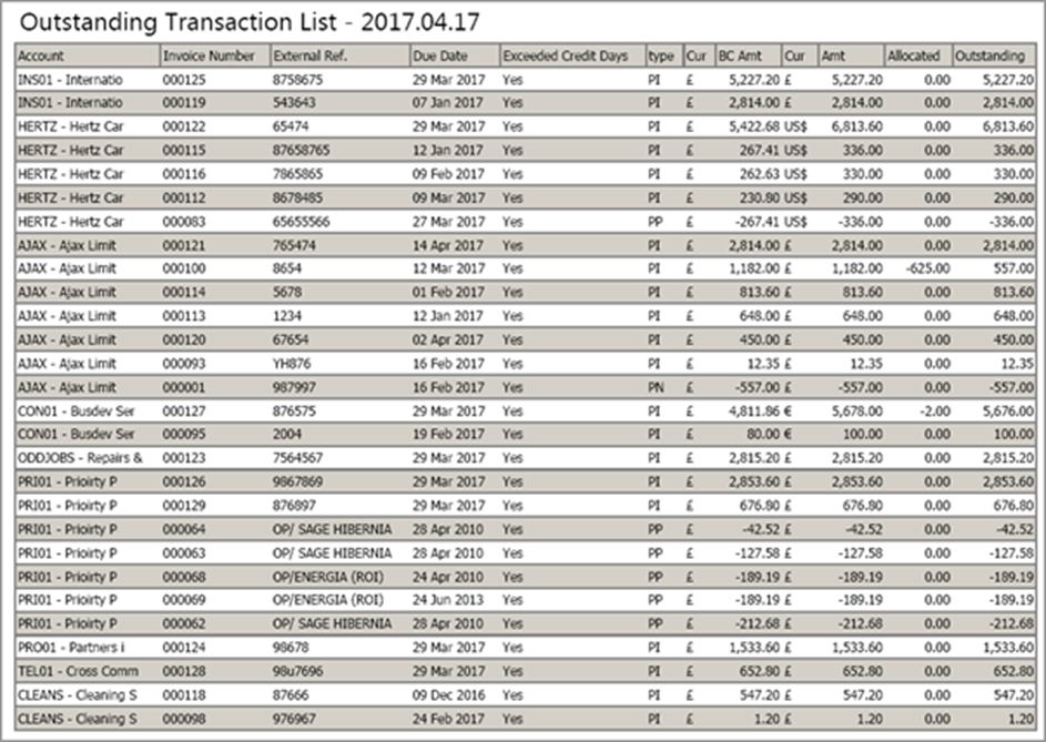
The following is an example of the export of the Transaction List to PDF:
Filter
Click the second symbol to filter. When you click on a Bar in a Chart, the remaining charts, and the transaction list filter by the contents of the clicked Bar. In the Chart the bar is from, the filter symbol appears. To remove the filter, click it again in that Chart and all other Charts.
In the following example, the 31 – 60 days Bar was clicked.
Before filtering:
After filtering:
Click the filter symbol to remove the filter parameters.
Multi-Select
The third symbol (which looks like a stack of bricks) acts as a compound filter. When clicked, this allows you to select several bars in a single chart for filtering. Click the filter symbol to undo the selection.
You can also click on several Bars from multiple Charts to create a compound filter. For example, if you want Euro-only transactions that fall into the 31 – 60 days date range. To clear the filter, click on the filter symbol in both charts.
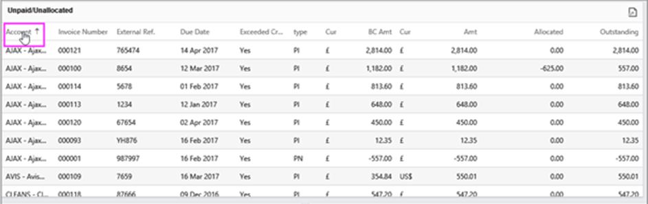
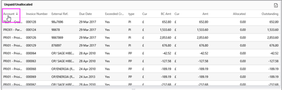
Lists: Sliders and Sorting
A slider for scrolling automatically appears for longer lists.
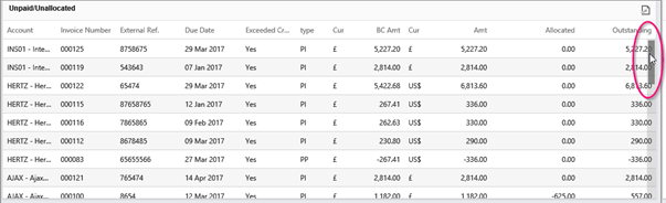
You can sort the list columns. Click on the Column Header once for ascending order and again for descending order.